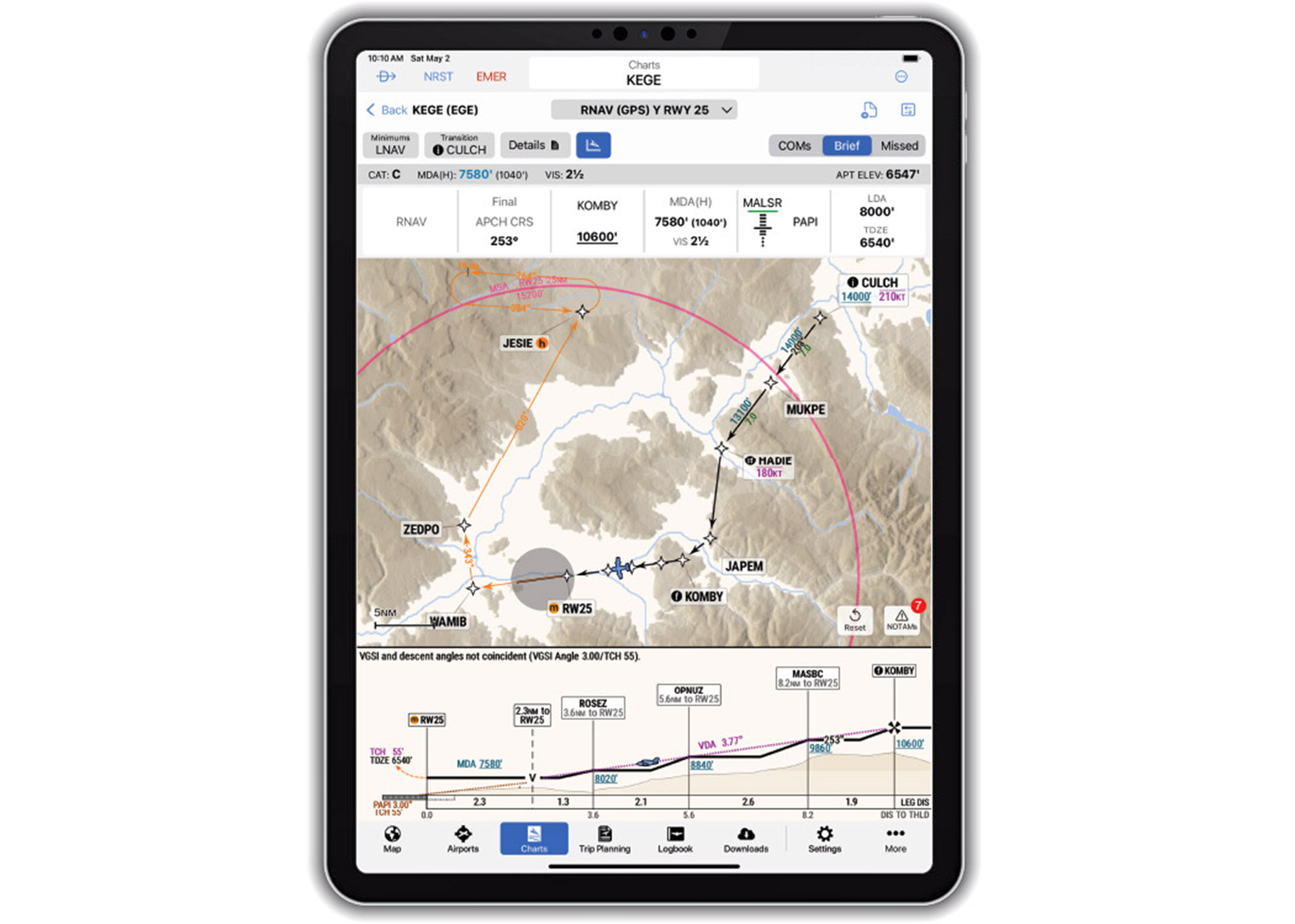
The workload and setup for trouble is real. A pilot who doesn’t fly enough IFR to really stay on top of the game finds himself flying an approach to lower minimums than expected, gets behind the aircraft and then loses it on the missed approach—if he gets that far—because he inadvertently busted an altitude after misreading the chart. Maybe the chart had too much overwhelming data or it was simply too crowded with information.
That’s only one reason why Garmin thought it was time to modernize digital procedural charts, and given the pattern of surface incursions—that certainly includes surface charts. Enter SmartCharts, a project long in development in the Garmin think tank, compatible with the Garmin Pilot app for iOS.
Digitized, data-driven
While SmartCharts aren’t compatible with panel avionics like the GTN and G3X Touch/TXi display (yet), they are fair game for use as the primary source of chart data for instrument approach charts, departure procedures, standard terminal arrivals and airport diagrams.

During a demo with Garmin’s Kyle Ludwick—who played an integral role in the later development of the product—he made a good point that many procedural charts include data that might be irrelevant to the flight, which is a setup for trouble. Remember that instrument procedural charts have been around since the 1930s and while we’ve come a long way from those early charts, today there are far more categories of aircraft and different kinds of approaches, plus a lot of notes that may or may not be relevant to the aircraft or procedure being flown. In today’s digital world, it was time for an overhaul.
There are big advantages to a digital interface, including the ability for SmartCharts procedures to automatically adjust and scale as the pilot zooms and pans within the chart. If you’ve used chart-equipped Garmin IFR panel avionics, you’ve seen an example of Garmin’s data-driven mapping, and now this data also allows SmartCharts to highlight details and notes that could be easily overlooked and lost on traditional digital charts—including ones from Jeppesen and Garmin’s Flight Charts.
But globally sourced digitized data also allows for automatic adjustments to things like approach minimums, calculating minima height adjustments based on NOTAMs and alternate minimums. Check out the SmartChart for the ILS or LOC RWY 04R at Boston’s Logan Airport on page 4, automating the charted minimums to reflect the presence of tall ships in Boston Harbor. On a traditional digital chart, you might scroll all the way to the top to see what the pound nomenclature (S-LOC 4R#) means, which at Boston references the ILS approach minima when the ships are NOTAM’d. Because of the 140-foot obstruction, the approach’s 3-degree glideslope won’t work.

The way it works on the SmartChart is you first click the Minimums key in the upper left corner and select the aircraft’s speed (A, B, C, D and so forth) category. For the 121-140 speed category C, the SmartChart shows that the ILS minimums are Not Authorized with an attention-getting yellow NA tag. There’s also a yellow-on-black Minimums N/A label stamped on the chart’s profile view. In the world of aeronautical charting, frankly we think this smart interface is a huge step forward.
Less clutter means a better workflow
Garmin said that a big effort when developing SmartCharts was to reduce pilot workload (and error) by only providing chart data that’s relevant to the flight. As an example, you can make customized selections, including the aircraft type and the arrival, departure or approach transition fix to the runway. Simple—show the pertinent data for briefing and flying the procedure. Notes and symbols that you might have previously looked up are positioned next to the appropriate detail, or they can be turned off. Garmin’s Ludwick recognized the gotchas.
“There’s a lot of symbology to memorize with charts and while we did it for our instrument rating written test and on the checkride, there’s a lot to forget—even when flying a lot of IFR,” he said. He’s right, and it’s a good argument for keeping clutter to an absolute minimum and especially for aging eyes that might struggle with small text in the heat of battle.
Using STARs and SIDs as an example, you select your aircraft type, the route transition you are flying, plus the intended runway. This customization reduces the displayed information to only show the routing, fixes and crossing restrictions pertinent to the planned or expected procedure.
The Quick Access buttons also reveal pertinent procedure information like briefing information, communications frequencies and graphical missed approach icons so you can hopefully find and decipher needed information based on the phase of the procedure you’re flying.
Using an approach procedure as another example, the approach minima on a SmartChart are updated and presented with simple selection softkeys for aircraft category, approach type—ILS, LOC, LPV, LNAV, LDA—and other adjustments like local or other altimeter settings, inoperative airport lighting and also flight director or HUD use. Here’s where SmartCharts simplify the task because those selections then present only one minima number to reference, eliminating the need for mental math you would use with traditional charts. Waypoints, legs, crossing restrictions and other details are then more clearly depicted on the chart as users make selections and adjustments. This ultimately removes unnecessary information from view, leaving the user with a single route in view to help reduce workload and the chance for errors.
Briefing, vertical profile
Briefing an unplanned approach is a trap for getting it wrong and SmartCharts automate that, too, with the user pressing Brief, Coms and Missed Approach softkeys. That presents the pertinent information, including those forgotten notes from training that Ludwick was talking about. Where it also comes in handy is during a rebriefing when there’s a runway or procedural transition change. Speed and altitude restrictions? These are depicted on the plan view on Garmin’s arrival, departure and approach SmartCharts.
Perhaps one of our favorite additions on SmartCharts is an expanded approach vertical profile view. Because it’s georeferenced (GPS positional data is fed into the Garmin Pilot app either through the device’s GPS receiver or an external receiver like an ADS-B In receiver), the aircraft is overlaid on the profile portion in its real-time altitude. It seems pretty tough to run into terrain and obstacles on the approach with this graphic.

Smart surface charts
From the Airports page in Garmin Pilot, let’s pull up the airport diagram for EWR in New Jersey, shown on the next page. There are some things that SmartCharts have that traditional terminal procedure charts don’t, including color markings. This includes ILS areas, hold-short lines and a visual, color depiction of the approach lights you’ll see when you come out of the clouds at minimums. All markings are to scale and gone are the arrows that simply point in the direction of hot spots.
Following the format of other cedural SmartCharts, airport diagrams have what Garmin calls Quick Access keys for calling up the airport’s details. You know—stuff you would find in that old little green Airport Facilities Directory—like comm frequencies, runway info, alternate minimums and symbols. Notes that would otherwise be scattered around the chart are now cleanly organized in a general operational notes tab.

The Runways and Departures tab is where you find the runway’s takeoff procedures, obstacles and minimums, plus obstacle notes. The Alternate Minimums is where you set the approach category to change ceiling and visibility minimums for available approaches. The COMs tab declutters the frequencies stamped on the traditional chart and logically files them for viewing. Remember doing all that with paper? Forget it.
Smart departures and arrivals
Another procedure bindered in the Charts tab, charted departures are considerably cleaner in SmartCharts. The fixes along the route declutter, of course, but in the upper left corner is the answer to the age-old checkride question of whether the runway and transition is applicable to your aircraft. Now, tap the Aircraft key and it tells you. Set the runway you’re launching from and get a visual depiction of the charted turn after departure, and select the transition—which declutters all the ones you haven’t selected. The Details tab shows top altitudes, routes, transition altitude and general notes for the procedure selected. And because you selected a route off a certain runway to a certain transition, the chart only depicts the one you want—not several that you don’t.
Arrivals are decluttered, too, where you previously might have annotated the route and transition because there were so many on the page. You only see what you entered to fly. And no more excuses for busting speed and crossing restrictions—they’re clearly identified in color along the applicable route.
Garmin pilot app only
We think SmartCharts injects a healthy level of data automation in this app, where you need a $209.98 Premium U.S. (and Bahamas) yearly subscription and an iOS device. At press time, standard Pilot subscribers got a three-month upgrade to Premium. There’s also a 30-day free trial.
It’s logical to ask why you can’t use SmartCharts on a GTN 750 or G3X Touch—we did, too. Garmin was noncommittal, but we suspect they’ll eventually be compatible. For now, we think SmartCharts for iOS is enough to sway users from the competition and keep existing customers who might have been tempted to try something else.
Watch the SmartCharts demo:
Visit www.garmin.com.