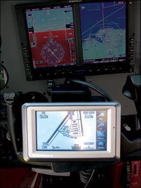
Was it really four years ago when Garmin blew us away with the GPSmap 396, a stunningly capable portable that offered datalink weather and even traffic? Indeed it was and now the 396 is about to be consigned to the boneyard, an inevitable victim of the relentless product cycle. The new arrival doing the displacing is called the aera and its being sold by Garmin at four price points, each with a different feature set. (See the chart on page 6 for details.) In aviations glory days, the manufacturers frequently introduced what we called “parts bin” airplanes, new models fashioned from the bits of existing airplanes in the product line. Garmin has done its version of the same, leveraging the hardware from its terrestrial or marine lines into aviation products and vice versa. The aera products were morphed from Garmins street navigator suite, specifically a premium product for the motorcycle market called the zumo. But were told its more clean sheet than adaptation. Unlike previous portables, the aera represents a substantial operating logic departure in that its entirely touchscreen driven-gone is the rocker switch and the push-enter-to-activate-editing function. In fact, gone are all the buttons and keys-only one remains: the power switch. The operating logic seems to more or less parallel Garmins nuvi line of street navigators, which is to say the menu structure is icon based and as simple to use as an iPhone. No one should have trouble learning this device.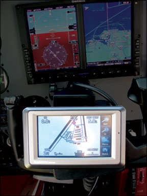
Hardware
The aera series has a 4.3 inch QVGA display screen thats a half inch in larger on the diagonal than the 396/496 series. That gives a 28 percent increase in area. The display is a backscreen illuminated TFT LCD whose touchscreen function works by sensing the users finger pressure. Overall, the device measures 5.2 by 3.25 inches and is 1 inch deep, making if not a more compact package than 396/496, at least one that uses its footprint for display more efficiently. The aera weighs 12 ounces.
The yoke mounting is standard stuff, except for one nice touch: Instead of snapping into its cradle with force fit plastic tabs, the aeras cradle has a pair of spring-loaded tabs controlled by a squeeze button. This makes it positive and easy to use, with little chance of popping out in turbulence. And speaking of turbulence, arent touch keys supposed to be difficult to use in green air? We hear this a lot, but the aera proved no more difficult-and maybe even a little less difficult-to manipulate in bumpy air than other portables have. The trick is to lock your hand in place with the thumb and middle finger and use your index finger to touch the keys. A little slower than just jabbing the keys, but its effective.
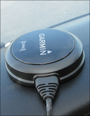
The manual we were provided gave no battery life, but we would say four hours is about the limit, but less if the screen is on max bright and/or the XM antenna is connected. The XM receiver is in the aera itself, but the antenna requires power. So plan on ships power to allow continuous usage at maximum screen brightness. The power cable is part of the yoke mount and it mates through a multi-pin connector on the back of the navigator. (To protect against pin damage, the springloaded pins contact a flat round contact, not a female receptacle.) The power cable merges with a data cable that
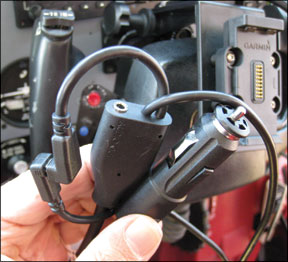
connects to the remote XM receiver puck, so wiring is minimal. Although there’s a remote antenna option-its not provided-we never used it; the receiver sucked in signal from anywhere in the airplane. In fact, it initialized and ran perfectly from the center seat of an airliner, with the window shade pulled down. The XM receiver easily pulled in signal from inside a metal hangar.
Using It
There’s only one hard button on the aera, the power switch on top-everything else is controlled by the touchscreen. In basic operating format, the aera is not precisely an evolution of the 396/496, as those two navigators were basically evolved from Garmin portables going back a decade. Firing up the aera deposits you on a home-page, not a basic map, as with the 396/496 logic. Once it finds itself, the aera automatically displays the basic nav map, of which there is only one.
Otherwise, to switch gears, everything happens from the homepage-the nav map, the terrain map, the HSI panel, the nearest list, flight planning and direct-to navigation. Like a computer or the iPhone/iTouch devices, there’s a key in the lower right hand corner of the screen to navigate back to the homepage and, depending on context, a back key. This makes it impossible to get trapped in a blind alley of nonsensical logic if youre trying to accomplish something by trial and error. Punching the home or back key gets you out of whatever blunder you got into so you can try again. There’s also a cancel key, which turns off active editing functions to return you to where you started. Touchscreen options on the main map screen are spare. You can zoom the scale up and down, use a dedicated key to declutter or show and hide data fields, the weather overlay, topo details and so on. As with the 396/496 logic, you can pan around the map and call up details on various waypoints and features, but rather than doing this with the rocker-always rather awkward-you simply touch the screen and use your finger to pan around the map. To drill into a waypoint, touch it to call up the basic info-the name of the airport and its elevation. We noticed that during moderately fast panning, the screen refresh is sluggish. It takes a practiced finger to get it right. The panning function is adequate, but not silky smooth like an iPhone.
For all the details, there’s an additional data tab at the bottom of the screen providing direct access to frequencies, runway data, the AOPA Airport Directory (depending on model) and current weather, if XM WX weather data is engaged. To get back to the map page, just use the back key until you get what you want. It doesnt get much simpler and the aera is not larded up with a bunch of extra screens it doesnt need and buyers probably don’t want anyway.
As for the tactile feel of the touchscreen, we would rate it as good-maybe an eight on a scale of 10. It takes accommodation because sometimes you get the command the first time you touch it; sometimes it takes two or three tries. If anything, we would say the touch is a little undersensitive rather than oversensitive, by design, we suspect. It would be a nuisance to have the thing constantly performing uncommanded functions. We experienced one miscommand repeatedly and a second twice. The first was hitting the map icon and getting a data page instead; the second was accidentally hitting the zero brightness scale and blanking the screen. This is a serious problem if it happens in a sunny cockpit because its almost impossible to see enough of the icons to bring the brightness back up, although you could
easily do so at night or in a darkened room. Recommendation? There should be no zero brightness setting. If you want the thing off, turn it off.
But is the touchscreen better than Garmins keys and rocker? We think so, but by degree. The rocker keys also suffered from being a little undersensitive and using the rocker to key in data is tedious at best, especially for a long flightplan. But the controlling issue making the touchscreen simpler and better is the operating logic: Its just cleaner and more streamlined, in most cases.
Then again, in some cases, the aera is just different. To enter a flightplan, for instance, you start on the home-page by punching the flightplan icon, then a side menu key to get to the new flightplan option. So far, just as many steps as the 396/496 logic. But there’s a twist. To enter waypoints, you no longer have to rocker scroll through every letter in the alphabet, because there’s a soft keyboard to allow direct entry of the waypoint identifier or you can pick from a recently used list. This is not just better than the rocker, its way better, in our view. The keyboard has a nice visual repeater function that confirms when youve hit the right key. If you havent, you can easily erase with a backspace key. These actions are obvious and not difficult.
In our view, the keyboard is the thing that makes the touchscreen worth having. Once you get the knack of using it, its faster and more accurate than scrolling through the alphabet with the rocker and its presence seems to inform a more transparent overall operating logic.
The GPSmap 396 blew us away with its sophisticated featureset and when the 496 arrived, it added incrementally to that, with Garmins SafeTaxi ground awareness feature and the AOPA directory. The aera doesnt add any substantial new features that will revolutionize navigation, but it has its share of high-end features. Leading these, in our view, is the XM WX weather option, whose implementation strikes us as we’ll handled.
Once the remote receiver/antenna is plugged in-no magnet in the thing this time-the data downloads quickly and is available for viewing. Depending on the service you buy, the aera displays nearly the full range of XM WX products, each accessible via a series of labeled icons on the weather page. This is more intuitive to use than the tabs and labels Garmin provided on the 396 operating system, which required tedious thumbing of the rocker switch to access.
The aera retains other 396/496 features, including the flight panel or HSI page, an E6B calculator and now the addition of a weight and balance calculator, all of which are immediately accessible under the tools icon on the homepage.
The aera is also fully capable of receiving XM audio and has an audio jack on the side of the chassis for either an earbud or an audio cable into the aircraft system. As the ultimate nod to convergence, the aera includes a ground navigation function which is essentially Garmins market dominating nuvi navigator. Since the product is shipped with both a yoke and a dash mount and given its more practical form factor, we think its more convenient to shift it from the airplane to the car and
back again than the 396/496, which was never a perfect fit for a car dashboard, without crowding.
Conclusion
In our view, the 396/496 were never the ideal form factor for yoke mounting. They were a little too deep and a little too heavy than what we would consider to be ideal. However, they more than made up for this minor shortcoming with impressive capability in navigation and datalink. Does the aera go those products one better?
We think it does. It is, if nothing else, a logical evolution of a product line thats beginning to show its age, even if customers arent necessarily anxious to upgrade to something else, given the current economy. In our view, the touchscreen is brilliantly executed and Garmin engineers used the opportunity to streamline the operating logic. Although were sure users will find some minor nits to pick, anyone who cant learn to operate this thing in under five minutes shouldnt be allowed out of the house without supervision.
Still, the aera lacks the wow factor of the 396, a product that was a giant leap forward and thus a hard act to follow. Functionally, it does about the same things the 396 did, albeit better. The question is, which aera model is the best value? This is not easy to answer given the way Garmin has shuffled the price tier. The bottom-of-the-line 500 sells for $799, but it lacks the XM receiver, SafeTaxi and the AOPA directory. At $1299, the 510 has XM, but no SafeTaxi or AOPA directory. The $1499 550 has no XM, but does have SafeTaxi and the directory. If this yellow brick road of price and features appears to lead you directly to the $1999 560, just guessing here, but we suspect thats exactly what Garmin has in mind.
In considering the lower priced models, you have to ask yourself if there’s ever a time when you wouldnt want weather, SafeTaxi or the airport directory, make the choice accordingly. Otherwise, the top-of-the-line aera 560 is the best choice.

