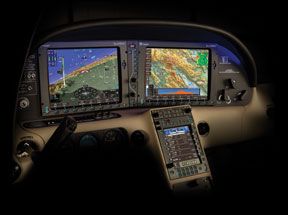
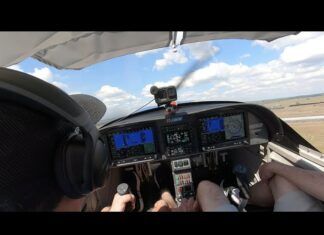
The first thing we noticed about the SmartDeck is that its just looks great. Our flight tests proved that this beauty was more than skin deep. Subtle shading and thoughtful grouping of information meant we were rarely searching for something on the screen. This is not the case with other, more widely used integrated cockpits.

That attention to detail and the pilot interface is, perhaps, both SmartDecks greatest attribute and its greatest flaw. L3 took its time putting this thing together-perhaps too much time..
The current SmartDeck began as a clean-sheet design in 2003. It was certified for the Cirrus in May of 2008, and an improved version with synthetic vision and full, datalink weather will be released this fall. Highway-in-the-sky (HITS) and other improvements are in the works but have no committed timeline.
Meanwhile, Garmin G1000 users can upgrade to syn-vis and HITS today, and both Avidyne and Bendix-King have new glass cockpits in the ring. There’s not enough room in town for all these cowboys, and the winner may be the one with the fastest draw rather than the sharpest shot.
Its The Little Things
During our talks with engineers and on our flight tests, we kept coming across smart design decisions. For example, the system will only ship with two Air Data and Heading Reference Systems (ADHRS). This matters because loss of the ADHRS in these glass cockpits is crippling, leaving the pilot flying on a back-up attitude, airspeed and altimeter with no autopilot and, possibly, limited or no navigation (depending on the exact failure). G1000 installations on most light singles are single ADHRS.
The PFD and MFD are controlled by softkeys along the bottom, and a skinny set of buttons and knobs that sit between them. A white line snakes along these vertical controls to separate the MFD ones from the PFD ones. Wed like to see some tactile difference in the knobs that control the MFD and PFD to further prevent confusion, but the visual works acceptably. The plus of this design is that you don’t have to reach in front of your passengers lap to get full use of the MFD.
SmartDeck also calls your attention to items in, what we believe, is just the right level of awareness. Navigation messages appear in the center of the HSI, right in
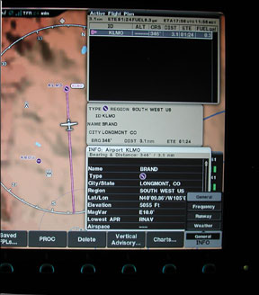
your scan, in black and white to let you know about upcoming holds, turns and waypoints. Rather than forcing you to activate an approach from a sub-menu, a dedicated softkey on the PFD offers the option at a button push when its appropriate. The same softkey lets you leave a hold, activate a missed approach, and so on.
If you push the go-around button on the throttle, the system assumes you want the missed approach and activates it automatically. Hey, you were busy, and these systems are supposed to make your life easier, right?
Alerts, cautions and warning messages are equally we’ll balanced between being noticeable but not annoying. They even got the lawyers to back off so not every deletion of a flight plan waypoint requires the yes-I-really-want-it-gone confirmation. SmartDeck just double-checks on the important ones.
Basic control of bugs for heading, altitude and vertical speed, as we’ll as altimeter settings and HSI controls are done by softkeys along the bottom of the PFD and a single knob. Some have dinged SmartDeck for not having dedicated knobs for these things, but our flight tests showed this was a non-issue. The system is fast and intuitive, and the grouping of the controls is, in our opinion, far better that the scattered placement of knobs on the basic G1000 bezels. (The new Cirrus Perspective, with both good organization and dedicated knobs, is an exception.)
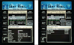
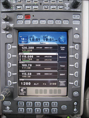
SmartDecks third screen is the Center Console Unit (CCU). This box sits where the radio stack would be in the Cirrus and is your primary control for comm, nav, audio, transponder, autopilot and flight plans. Its default screen shows your tuned comm and nav radios-and the name of each one in plain English. Sure, you can check the plate to make sure 125.5 is really Boston Approach, but automating it is just one less step or moment of uncertainty for the pilot. Those moments add up.
The engine/system page is we’ll done as we’ll with another clever tidbit: Trend information. Oil temp seems high? Roll over that indicator and see the trend for the past 10 minutes.
Flight plans are organized and entered on either the MFD or the CCU. The insertion point is clearly between waypoints rather than on top of one. Also, you can enter custom holds and altitudes right into your flight plan.
We also liked how configurable the system was. The map features are customized through simple on-screen on/off buttons. Handy data on the PFD can be customized or turned on and off as each pilot wishes. When you load approaches, the system shows you a preview of what the approach will look like on the MFD. Its a useful feature, but it also obscures your current moving map. If you like the feature, keep it on. If you don’t, turn it off.
Finally in the user interface department, SmartDeck has one of the one of the best user manuals weve seen so far.
SmartDeck also offers all the usual suspects of datalink weather, digital charts, TAWS, traffic and lightning detection.
We first flew SmartDeck in March at L3s base in Grand Rapids. This was pre-certification and, although we liked what we saw overall, we had some complaints. We even managed to uncover a minor bug unknown to L3 during our flight testing. We flew the revised version at Oshkosh in July and discovered … it got better. Some of our nits were fixed (as was the bug) and sythetic vision improved the
overall experience. It was our experience with the newer system that convinced us to award the title “best” to SmartDeck. But it only wins by a hair.
HITS is Missing
If SmartDeck had come out a year ago, the title would have been a slam dunk. But now Cirrus has shown what the G1000 is capable of when mated with real integration, HITS, a true Flight Management System (FMS), and well-thought-out ergonomics. Wed expect to see other OEMs take the hint and improve their G1000 offerings, too.
SmartDeck doesnt have HITS, or a second moving map. The PFD thumbnail map was a brilliant move by Garmin because it gives you a map to see while the MFD is in use for flight planning, weather, charts and so on. SmartDeck lacks this. Its less of an issue with syn-vis, but its still a big miss, in our opinion.
SmartDeck uses a standard audio panel to control which radio youre using for transmitting and receiving. Were all for using off-the-shelf technology, but this one doesnt work we’ll as we see it. You think youve switched radios by inputs on the CCU, but really you just changed frequencies or moved a cursor.
Radio control is also an issue when youre editing flight plans on the CCU because you need to either exit the flight plan or use the MFD interface for the radios. This is annoying when youre partway through editing a flight plan and get a frequency change. The MFD control is cumbersome, so wed like to see a way to quickly show the radios and toggle back to the flight plan. Another oddity is that if youre editing your flight plan on the CCU, you have to close that window before youre allowed to open and edit it from the MFD.
L3 touts that no function is more than three button pushes away. Thats true, but it leads to some inconsistent user interface that can be confusing. For example, a
knob controls zooming on the map page, but on the weather page the knob moves the cursor on the screen and buttons control the zoom.
There are other nits we could pick. There’s no dedicated bug for minimums on the approach, some on-screen type may be a bit small for the bifocal set, and sometimes its confusing if you cycle through items by pushing a button twice, or pushing a button and then turning a knob. Also, systems like this cry out for real FMS controls with a keyboard. Scrolling through letters with a knob is just so 2007.
Smart Systems
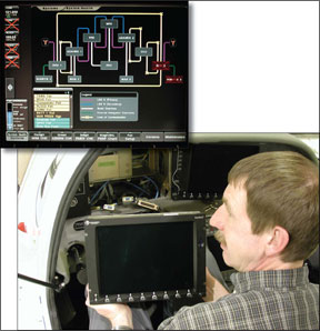
We spent some time looking behind the screens with an eye toward maintenance and liked what we saw. The screens are interchangeable and come out quickly. Cables and other aircraft controls are easy to reach through the empty space left behind. Data is exchanged through firewire connections (commonly used with digital camcorders). Technicians can easily download data to a portable hard drive.
The system has a built-in maintenance mode, letting a technician use the PFD and MFD for diagnosis and tasks such as aligning the ADHRS.
The autopilot is fully digital and works well. We think L3 needs to take a page from Garmins autopilot playbook and run the trim motors faster, however. Aggressiveness is an asset with a fully-digital autopilot.
Unique to SmartDeck today is L3s Iris infrared camera system. Cool items for the future might include touch-screen technology.
But Who Cares?
No matter how good SmartDeck is now or could be, its irrelevant if no one buys it. The system is scalable to the Level-A Part 25 level needed for bigger turbine-powered aircraft and is currently installed on the prototype Cirrus VT-50 jet. Neither Cirrus nor any other manufacturer has committed to using SmartDeck, however. L3 plans to explore aftermarket installation but, in our opinion, theyre dead in the water without lining up a few OEMs.
If L3 ties up the loose ends of SmartDeck and gets it in a few cockpits, itll be a pilot favorite. If not, we suspect it will be another pretty face who discovered it takes more than talent to cut it in the big city.
Jeff Van West is Aviation Consumers Managing Editor.

