In the market survey article on electronic checklists (August 2016 Aviation Consumer) I concluded that the checklist utilities in panelmounted avionics and most EFBs were no better—possibly worse—than paper checklists in terms of effort to use them. Sure, a few of the dedicated checklist apps for tablets and smartphones were better than paper, but none were as good as the challenge/response checklist method I was accustomed to in my airline flying job.
As promised, I continued to watch the market for a follow-up report and ultimately began using the MiraCheck Copilot. While it’s still maturing (rapidly), I think it’s the best the market has to offer. Here’s an overview.
Just What I Wanted
Like many GA pilots, I diligently used checklists on the ground, but even in the mighty Cessna 150 I used in training, in the air things seemed to get too busy. I always figured there had to be a better way.
When I joined an airline I discovered the challenge/response method was precisely the better way. The pilot flying would call for a checklist, “After takeoff check,” and the pilot monitoring would state the title and read each item, waiting after each for the proper status from the pilot flying: “Landing gear?” “Up.” “Flaps?” “Up.” “Power?” “Set” and so on.
In this way, the pilot got a thorough checklist without having to divert attention. He didn’t have to grab the card, find the right place, then keep his place as he read each item. Instead, it only took a tiny bit of mindshare to confirm and verbally answer the challenge from the other pilot.
Jeff Bonasso at MiraCheck read the Aviation Consumer checklist article and turns out he was a disciplined programmer who was also a seasoned pilot who was writing a checklist app. Bonasso asked if I would be interested in consulting with him on the program’s design and testing. Figuring it was another kludgy tablet app, I ignored him, but he persisted and ultimately impressed me. In full disclosure, I have an interest in the success of this app for reasons of my participation, but I have absolutely no financial involvement.
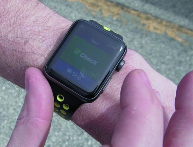
Initially, the MiraCheck Copilot could speak checklist items, but it couldn’t accept an answer verbally. My bottom line was that an app had to be verbally interactive, so he went to work. A few days later, Mira could hear me say, “check.” We then had a discussion on “check” versus status (see the sidebar on page 22.) I wanted Mira to actually respond to a status, not just the word “check,” and a few days later she had that option.
Since MiraCheck was being designed to work the way I thought it should, I liked it enough to write a follow-on article, this one appearing in the December 2017 issue of sister publication IFR Magazine. In the few months since, and without my further participation, Bonasso took MiraCheck far beyond what I envisioned.
The Basics
MiraCheck Copilot runs on iPads, iPhones and works with an Apple Watch, plus a somewhate less capable version works is available for Android. You get basic functionality for free on one device, including a brief trial of the Pro version. You can buy the Standard version for $29.99 to get a few more features and support for three devices. The full Pro version is what I evaluated. It adds verbal interaction, web history and a more useful features. Pro costs your choice of $4.99 per month, $49.99 a year or $129.99 for life.
MiraCheck can function stand-alone, but working online, it’s easier to create and maintain your checklists. The web interface also stores all your activity so you can review any flight. Of course, once you go flying, you can’t reach the website without an internet connection. You can create a checklist from scratch, import one from Excel, use one provided by the user community (vet that carefully), import a full POH from one of dozens of aircraft or you can use one of CheckMate’s commercial offerings.
A single checklist can be thought of as everything you need for a particular aircraft. You’ll divide each into lists for phase of flight: preflight, inflight, postflight, etc. Each list contains sections. For example, your inflight list might contain sections for takeoff, climb, cruise, etc. Then, each section contains the individual items—the task you’ll perform or the setting you want to confirm.
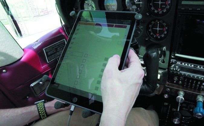
By default, each list (phase of flight) remains visible in a sequential ribbon across the bottom. The sections in the current list scroll across the top with the active section left-most. Completed sections are off screen to the left.
Items in the active section scroll vertically on the left side to keep the current item in the middle. This way, you can keep your left thumb poised in one position and never move it as you work through a menu. Similarly, there’s an acknowledge button on the right side that you can repeatedly hit with your right thumb.
Or, you could turn just about the whole screen into one big acknowledge button that you could find and hit even when bouncing in severe turbulence. Many other configuration options illustrate the thought and usability that’s in this program.
If your device is running iOS 10 or newer (the last couple years), MiraCheck Copilot will multitask so you can use it alongside your favorite EFB app—a big convenience.
Chatting With Mira

Mira can read to you and you can touch the screen to acknowledge. Or, you can configure MiraCheck so that she talks and you answer (configurable to listen for “Check” or the desired status). She then moves to the next item. As each section in each phase of flight is complete, Mira goes on to the next in sequence.
She’ll allow you to skip items. But, when you do, Mira can be configured not to let you leave a section until you’ve completed the skipped items. Even so, if you try to leave twice, she’ll let you.
Of course, to converse with Mira, you’ve got to be suitably connected. You can use a wired connection between your iDevice and your aviation headset. More likely, you’ll use Bluetooth. In both cases you’ll use the music input on your headset; be sure to disable any muting of that input during other audio. Best results are obtained by connecting a top-quality aviation headset directly to your iDevice (not through an audio panel, even with Bluetooth). MiraCheck uses the speech recognition service provided by your device—which has gotten good but isn’t perfect.
You can jump around using touch or voice. Say, “Mira, Engine Failure,” for example, and she’ll read your engine-failure section. In this way you could toss your iPad in the back seat and use MiraCheck hands off.
Quite Versatile
Each list, section and item has a variety of controls when you build your checklist. By default Mira will read the text for the name. So, when my Cessna 340 checklist starts, she’ll awkwardly say, “Cessna three hundred forty.” You can specify alternate text to be read. So I specified the text to be read and she now says, “Cessna three forty.” While this example uses the checklist name, the same ability exists for lists, sections and items.
When something is displayed, you have the choice of font color, icon color, background color and border color. This way, you can color-code your checklist, like red for emergencies.
Each item can be normal fixed text, which is the most common and what we’re used to. But you can also specify an input, either free-form or selected from a variety of formatted pick lists: yes/no, date, time, address, etc. So, for example, in your preflight section you might want an item where you record the Hobbs time. The response could be as simple as “Check,” the default, or it could be a response you specified, like “Recorded.” Or, it could be a blank on the screen where you type in the Hobbs time. (Remember, the full history of your use is on the website.) You can even configure it so you can upload a photo of the Hobbs meter that you take with your device right then.
In more sophisticated aircraft, there’s often a large set of emergency do lists. Often those do lists will branch off in one direction or another, based on the circumstances at that moment.
Take the example of a Citation’s emergency checklist for smoke in the cabin. Different actions might be taken based on whether smoke is from a known or unknown source, or if your actions are decreasing the smoke or having no effect. So, the item gives you a choice and takes you to the next portion of the list based on your answer.
Another useful capability is that a “section” can actually be a form you’ll fill out. You might design a form to allow you to enter the ATIS, a PIREP, a clearance (CRAFT) or anything else you might want. Similarly, you can use an item to display a specific bit of information. For example, during your Before Takeoff List, you might want to review your speeds. The item looks like a normal “Check” item, but when you touch it, you get a table of speeds to review.
I’m giving you only a brief glimpse into what MiraCheck Copilot can do. The biggest drawback I’ve found is that the app’s flexibility, power and, yes, complexity are barriers to entry. I initially avoided using MiraCheck for fear of going down a rathole of learning and configuration.
But, once I got my basic checklist in there and saw how easily and we’ll it worked—even skipping the fancy features—I was hooked. So, don’t let Mira’s capability keep you from giving her a try and benefiting, even from the basic assistance she can provide.
Do List vs Checklist

General aviation primarily uses “Do” lists, popularly called checklists. Let’s differentiate. Think of a do list as a sequential list of instructions of individual tasks to perform.
A true checklist in this context, on the other hand, is designed as a sequential set of verifications that steps have been performed, systems are in the desired state, etc. A checklist should make no attempt to instruct the pilot on what to do, but instead helps the pilot confirm that it’s been done. A checklist would never contain a V-speed, for instance, while the instructive nature of do lists will commonly tell the pilot to rotate at the specified speed.
In the classic “Do” list format, an item is mentioned, then its state is given. Munging the concepts of a do list and a checklist, the do list is commonly used as a checklist. This has given rise to “Check” as the response to each item and state: “Landing Gear—Down, three green—Check.”
This kind of a do/checklist is useful for student pilots and infrequent or casual pilots. It begins to get cumbersome with serious, active pilots. For those who typically follow a flow, a pure checklist is sufficient. In a pure checklist, it’s probably sufficient to merely mention the item or the task and have the response be “Check” because the mere mention of the item or task prompts the experienced pilot to verify the correct state. However, retaining a bit of the ancestral “do” list ideas, the professional pilot’s checklist most commonly today consists of an item—a system, switch or task—that is thought of as the challenge, and the desired state is the response. Thus, “Landing Gear—Down, three green—Check” becomes “Landing Gear—Down, three green.” Of course, using a challenge-response format can initially feel unnatural with only one pilot. You’ll get over it.
What you use is up to you; it’s a personal choice. If you’re comfortable with one way of doing things and you’re successful, you might keep doing it. However, if you find the basic item-state-“Check” do/checklist format is becoming unwieldy for you, experiment with the challenge-response checklist more commonly used by professional crews. You’ll probably like it.
Contributor Frank Bowlin is the editor of sister publication IFR Magazine.


